Q6) Explain use, properties and methods of following controls (ANY THREE)
a) Image Map Control
b) Bulletedlist control.
c) Text Box Control.
d) Calendar Control.Ans.a) ImageMap ControlThe Image Map Control works same as ImageButton control but the main difference is that you can define regions that are called hot spots. It cause a PostBack when you click on this region, whereas clicking anywhere on an ImageButton causes a PostBack. In ASP.NET framework there are three HotSpot classes:
CircleHotSpot: It defines a circular region in an image map.
PolygonHotSpot: It defines polygon shaped region in an image map.
RectangleHotSpot: It defines a rectangular region in an image map.
Properties ImageMap Control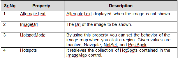
The ImageMap control has an event name Click. When you double click on this control you will get the following method in code behind file.
protected void ImageMap1_Click(object sender, ImageMapEventArgs e)
{
}
Example: Creating RectangleHotSpot with ImageMap control.< asp:ImageMap ID="ImageMap1" runat="server" onclick="ImageMap1_Click"
ImageUrl="~/XYZ.jpg">
< asp:RectangleHotSpot Bottom="100" HotSpotMode="Navigate" Left="10"
NavigateUrl="~/Demo.aspx" Right="200" Top="20" />
< /asp:ImageMap>
b) Bulletedlist control.The BulletedList control is used to display an unordered or ordered list of items. It is similar to HTML ul or ol elements. The item can be displayed either bullets or numbers based on the BulletStyle property. A custom image can also be displayed instead of the bullet.
The following example shows a data-bound BulletedList control. The control is bound to a data source control that selects the Employee table.
< asp:BulletedList runat="server"
ID="BulletedList1"
DataSourceID="SqlDataSource1"
DataTextField="EmployeeName"
DataValueField="EmployeeID" BulletStyle="Circle">
< /asp:BulletedList>
Important Properties of BulletedList control are as follows.BulletStyle: Circle, CustomImage, Disc, LowerAlpha, LowerRoman, Numbered,
Square, UpperAlpha, UpperRoman.
DisplayMode: Text,HyperLink ,LinkButton;
Items: It enables you to set the collection of items in the list
BulletImageUrl: The Url of the Image that you can set as bullet.
DataTextField: This field is available in database table and displayed as item text.
DataValueField:It provides the item value
Important Events of BulletedList control are as follows.protected void BulletedList1_Click(object sender, BulletedListEventArgs e)
{
}
protected void BulletedList1_TextChanged(object sender, EventArgs e)
{
}
c) Text Box Control.TextBox control in one of the most used control in any type of application. By using the TextBox control’s Text property you can get or set the the contents of the TextBox control.
Example:TextBox1.Text = "CareerRide";
String SiteName = TextBox1.Text;
Important Properties of TextBox control are as follows.TextMode:SingleLine: This is the default property and you can enter a single line of text by using this property.
MultiLine: It enables you to enter many line of text. By enabling this property TextBox control works as TextArea.
Password: It enables you to mask the text, entered in the textbox.
MaxLength: It limits the number of characters that can be entered by a user.
Wrap: It is Boolean property that enables you to specify whether text word-wraps when the TextMode is set to Multiline.
Events: TextChanged: This event will fires when text of the TextBox control is changed. For executing TextChanged event AutoPostBack property should be true.
protected void TextBox1_TextChanged(object sender, EventArgs e)
{
TextBox1.BackColor = Color.Red;
}
d) Calendar Control.This control displays a calendar on a Web page. You can use this control as a date picker or to display upcoming meeting schedule.
Important Properties of Calendar control are as follows.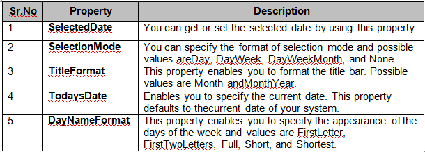 The Calendar control also supports the following events:DayRender:
 Fires at each day is rendered on web page.
SelectionChanged: This event will fire when you select a new day, week, or month.
VisibleMonthChanged: This event will fire when you click on next or previous month link.


