In this chapter, we will learn to apply nice formatting to data that is
displayed on our page. We will learn to do this by making use of Cascading
Style Sheets. We will also learn how to format our data automatically,
depending on the data values (a technique known as conditional formatting).
Then we will learn to filter and sort our data, use formulae to perform
calculations, and how to split our data up into multiple pages.
This exercise consists of the following major topics:
Formatting the Data View
Direct Formatting
CSS Formatting
Conditional Formatting
Formatting Numbers
Filtering Data
Using Formulae
Sorting Data
Allowing Users to Sort the Data
Paging
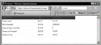
The default data view that we are presented with uses uninspiring black serif
text on a white background. We can jazz up our data view using two different
methods:
Direct Formatting
It is possible to apply formatting directly to our data view by highlighting the
cells that we wish to format and then using the formatting tools. This can be a
good option if we only want to format a single data view but is not the best
approach if we would like to apply our formatting on a site-wide basis.
CSS Formatting
A more manageable way to apply formatting to our data views is to make the
changes across the entire site by editing our style sheet.
When we click in the cell that has the Price heading in it, notice that a tag
appears above it, telling us that this cell is referred to as th.ms-vh. That is
to say that it is a table heading (th) element that is being rendered using the
ms-vh class (which I assume stands for Microsoft View Heading). Similarly, if
we click in any of the cells further down the data view, we see that they are
referred to as td.ms-vb (standing for Microsoft View Body). This reference is
used to specify the format of the cells in our table that display the actual
data.
In addition, there is an ms-alternating class that renders every other row with
a different background color.
To allow us to edit our styles, we must fi rst create a new blank style sheet,
which we will call share.css:
-
Select File | New | CSS.
-
Go to File | Save.
-
Give the fi le the name share.
-
Save the fi le as CSS Files fi le type.
-
Click Save.
The next step is to attach our style sheet to our site so that our pages can
refer the styles that we will create within the style sheet:
-
Open the Apply Styles task pane.
-
Click Attach Style Sheet.
-
Click Browse.
-
Browse to share.css and click it.
-
Click Open.
-
Under Attach to, check All HTML pages.
-
Click OK.
-
Click Close on the information dialog.
We will then make our style sheet ready to use by defi ning some styles. Adding
the following code to the style sheet will change the ms-vh and ms-vb classes
so that they are formatted in a more inspiring manner:
th.ms-vh, td.ms-vb {
font-family:gill sans, gill sans mt,
arial, sans-serif;
}
th.ms-vh {
border-width:0px;
background-color:#903;
color:#FFF;
}
td.ms-vb {
color:#903;
border-top-width:0px;
border-left-width:0px;
border-right-width:0px;
border-bottom-width:1px;
border-bottom-style:dashed;
font-style:italic;
}
ourtable{
border-width:0px;
}
Notice how the fi rst line of our style sheet refers both ms-vh and ms-vb, with
a comma separating them. This allows us to specify the font face in one place
rather than needing to enter it separately into each class. Grouping styles in
this way not only saves time when creating our site but also makes the site
more easily maintainable when we and other people make changes in the future.
If you are eagle-eyed, you will also notice that the color references (e.g.
#903) only have three digits rather than six. This is possible when a color has
repeating numbers (e.g. 99 or 00), allowing us to condense #990033 to #903.
If you are not familiar with using CSS, do not be put off using it because it is
easy to learn. We also get a helping hand, because when we type code into the
style sheet, SharePoint Designer uses IntelliSense to suggest code we may like
to use.
Once we have saved our style sheet, SharePoint Designer instantly refl ects
changes to the style sheet in the Design view of products.aspx.
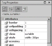
When creating our td.ms-vb style, we specifi ed that dashed lines should appear
below each cell. By default, SharePoint Designer has a default value of 0 for
our borders, meaning that they will not display. In order for the dotted lines
to appear, we will need to make sure that our table has a border value of 1. We
can do this by highlighting the whole table and typing 1 into the border
attribute in our Tag Properties task pane. Selecting ourtable as the class for
the table in this task pane will remove the solid border, allowing our dashed
lines to be visible in all their glory.
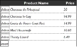
W e can take our formatting even further and use CSS to format the delete and
insert text links so they look like buttons, by giving them a border and some
padding. We can also give our "buttons" a different background color whenever
the cursor is positioned over them.
To add this additional formatting, we will place the following code into our
style sheet:
a:link, a:visited, a:active {
color:#903;
padding-top:1px;
padding-bottom:1px;
border-color:#903;
border-width:1px;
border-style:solid;
text-decoration:none;
}
a:hover {
background-color:#EEE;
}
A word of warning about specifying these styles for your links—they will apply
to all links in the share site (and it is unlikely that you would want to do
that). It would be better for us to create a new class (e.g A.funkyButton) that
we can use whenever we want to render our links to look like buttons.
Conditional Formatting
We can make our data views more meaningful by setting up our data view to
automatically use different styles in response to differing data values. This
technique is known as conditional formatting.
Applying conditional formatting in SharePoint Designer requires us to use the
XPath language. Don't worry though because SharePoint Designer makes this easy
for us.
We would like to apply some conditional formatting to our data view so that it
shows a differently formatted price for all wines that have a low number in
stock.
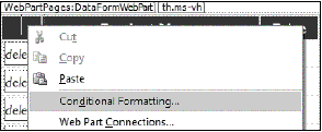
We start this process by right-clicking on our data view and selecting
Conditional Formatting from the shortcut menu. This will open up the
Conditional Formatting task pane.
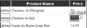
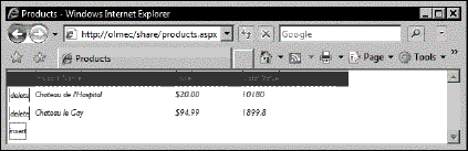
We then click on the data value that we would like to apply our conditional
formatting to. We will select any of the prices in the data form. Below, I have
selected the price of the most expensive wine, Chateau le Gay.
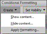
We then click the Create button in our Conditional Formatting task pane and
select Apply Formatting.
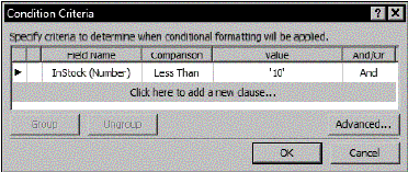
Doing so presents us with the Condition Criteria dialog box. This dialog is used
to specify the conditions for our formatting. To begin using the dialog, we
click on the line that says Click here to add a new clause…. We would like our
Price to be formatted differently if the number of products in stock is less
than 10, and so select the options in the diagram below and then click OK:
Now that we have chosen our criteria, the next screen allows us to specify the
style that will be automatically applied to our Price when the condition is
met. In the Font category, we will select a font-weight of bold, and in the
Background category, we will select a nice bright background-color of yellow
(#FFFF00). This vivid style will ensure that the information stands out to the
users of the site.
To mod ify the condition at a later date, we can click on the condition in our
Conditional Formatting task pane and select Edit condition… from the drop-down
list.
Fig 8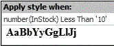
It is also worth noting that it is also possible to use conditional formatting
to change the visibility of the data so that it can be displayed or hidden,
depending on the value. This is useful to show or hide images. For example, if
the type of wine is red, show a red bottle. If white, show a white bottle.
Formatting Numbers
It is w orth pointing out that it is very easy to format numbers in our data
view so that they display as we would like. We can display our numbers as
percentages or as a currency and specify the number of decimal places that the
number should have. We can also control the 1000 separator so that commas
appear in the correct places to make large numbers more easily readable.
We will take the opportunity to display our prices with a dollar sign in front
of them by doing the following:
-
Rig ht-click on one of the prices in our data view.
-
Select Format Item as.
-
Select Currency.
-
This will open the Format Number dialog. Ensure that the Symbol is set to $.
-
Click OK.
Notice that we only needed to select one record and that all prices were
formatted in the same manner.
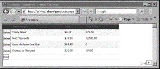
Filtering Data
It is p ossible to fi lter our data view so that only certain records are
displayed. We will use this functionality to display only products with a price
of over $15. This feature works in a similar manner to the conditional
formatting (albeit there is no formatting to be applied). To fi lter our data
view, we follow these steps:
-
Right-click on our data view.
-
Select Show Common Control Tasks.
-
Select Filter: from the list.
-
Click on the fi rst row to add our new clause.
-
Specify the following values:
a. Field Name = Price (Number)
b. Comparison = Greater Than
c. Value = 15
-
Click OK.
You will notice that our data view now only displays the products that are
priced over $15.
To remove the fi ltering, we follow the fi rst three steps so that the Filter
Criteria dialog appears again. We remove our criteria by right-clicking on the
black arrow to the left of the criteria and selecting Remove. Finally, we click
OK.
When us ing SharePoint Designer, it should be remembered that it is a fully-fl
edged member of the Microsoft Offi ce suite of products. As such, we can use it
to perform powerful calculations that you would expect other products in the
suite (such as Excel) to perform.
We will add a new column to our data view that will display the total value of
the wine the Wine Company has in stock. We begin this process by clicking on
our data view to select it and then going to Data View | Edit Columns….
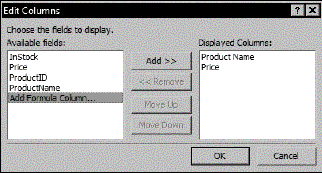
The Edit Columns dialog allows us to select the fi elds in our data set that we
would like to include in our data view. If we would like to add columns to or
remove columns from our data view, this is the dialog that we would use.
The dialog also allows us to add a formula column. We will do this now by
clicking on Add Formula Column… and then clicking on the Add >> button.
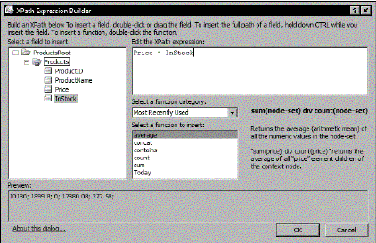
The XPat h Expression Builder then appears. If you have previously created
formulae in Microsoft Excel or Microsoft Access, then you will be familiar with
the principle behind creating formulae using a builder like this.
We can either type our fi eld names into the pane titled Edit the XPath
expression or drag them across from the fi eld list in the left pane. We can
also use my personal favorite method and double-click them across. Whenever we
type a space into the expression pane, IntelliSense suggests appropriate code
items including fi eld names and arithmetic operators (such as +, -, /, and *).
We will use the following simple expression:
Price * InStock
The following image shows the Expression Builder in use:
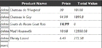
Once we c lick the OK button, SharePoint Designer adds our formula to our
Displayed Columns list as Formula 1 (important note: this has nothing to do
with fast racing cars!). When we click the next OK button on the Edit Columns
dialog, our formula is added as a new column on the right of our data view. You
may wish to take a moment to resize the width of your data view to 450 pixels
and to rename the last column Total Value.
Sorting Data
Hopefully, by now you are impressed with how easy it is to display data using
SharePoint Designer. When it comes to ordering our data, you will continue to
be impressed.
We would like to sort our wines so that the cheapest wines appear fi rst and the
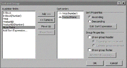
more costly bottles appear last. To do this, we use the sort feature:
-
Right- click on our data view.
-
Select Show Common Control Tasks.
-
Select Sort and Group: from the list.
-
Click on the Price(Number) fi eld and click Add>>.
-
Click on the ProductName fi eld and click Add>>.
-
Click OK.
It is worth noting that we can also group similar items together within the data
view. For example, if our data specifi ed whether the wine was red, white, or
rosé, then we would be able to group the data by type.
Allowing Users to Sort the Data
It is easy for us to give users the ability to sort the records in the data
view. We can enable this sorting like so:
-
Click on our data view to select it.
-
Go to Data View | Change Layout.
-
Click on the General tab.
-
Check the Enable sorting and fi ltering on column headers checkbox.
-
Click OK.
Once we have saved the page, users will be able to click on the column headings
to sort the records by alphabetical order (or numerical order, provided that
the data in that column are numerical values).
Paging
Although ou r example data only contains fi ve different products, there are a
huge number of wine products in the market (there are about 6,000 wineries in
the United States alone). Naturally, we would not want to display tens of
thousands of products all on one page. By using paging, we can specify the
maximum number of records that will be displayed in our data view at one time.
Depending on the options we have specifi ed, users may be able to click
forwards and backwards through the data view, displaying the next records each
time they do so.
-
Right-click on our data view.
-
Select Show Common Control Tasks.
-
Select Paging: from the list.
-
Click on the Display items in sets of this size: radio button.
-
Enter 4 into the fi eld.
-
Click OK.
Summary
Over the course of the last two chapters, we have discovered how easy it is to
interrogate a whole range of data sources and display information from them in
our SharePoint site in an attractive and useful manner.
Also read
What is SharePoint?, What is Microsoft SharePoint Portal Server?, How is
SharePoint Portal Server different from the Site Server?, How is security
managed in SharePoint?..........
|