|
The layout widgets in Dojo can often be alternatives to complicated CSS rules.
Many times it is necessary to create pages with a two- or three-column layout,
sometimes with a header and/or footer as well.
The layout manager widgets let you create powerful layouts without using more
than a minimum of custom CSS styling. The layout managers have a lot of
carefully laid-out styling that you can benefi t from without having to
interact with it. The BorderContainer makes sure that it has a proper margin to
the widget it contains, as well as adding (removable) ‘gutter’ border lines for
default clarity, for example. The TabContainer lets you programmatically choose
if you want the tabs on top, bottom, left, or right without using any custom
CSS, and so on.
This chapter will list a large number of layout widgets. Some are fully 'offi
cial', with accessibility support and internationalization. By the time of the
writing this book, some will be experimental, and are found under the dojox
directory.
Nevertheless, this book's intent is to give you a smorgasboard of widgets, so
that you know what you have available. One of the biggest challenges in
learning Dojo is the sheer volume of the framework. In previous chapters, there
were lists with short descriptions of useful Dijit widgets. The layout managers
are too important and too complicated to be reduced to a mere sentence or two,
which explains the volume of this chapter.
After the near-exhaustive expose of different layout managers and supporting
acts, there will be a couple of longer examples which, with some luck, will
give you some good practical points to elaborate upon.
Basic Dojo layout facts
The Layout widgets in Dojo are varied in nature, but their most common use is as
'windows' or areas which organize and present other widgets or information.
Several use the same kind of child elements the ContentPane.
The ContentPane is a widget which can contain other widgets and plain HTML,
reload content using Ajax and so on. The ContentPane can also be used
stand-alone in a page, but is more usable inside a layout container of some
sort.
And what is a layout container? Well, it's a widget which contains ContentPanes,
of course. A layout container can often contain other widgets as well, but most
containers work very well with a different confi guration of ContentPanes,
which properly insulates the further contents.
Take the TabContainer, for example. It is used to organize two or more
ContentPanes, where each gets its own tab. When a user clicks on one of the
tabs, the ContentPane inside it is shown and all others are hidden.
Using BorderManager can bring the necessary CSS styling down to a minimum, while
giving a simple interface for managing dynamic changes of child widgets and
elements.
ContentPane
A ContentPane can look like anything of course, so it doesn't really help
putting a screen-dump of one on the page. However, the interface is very good
to know.
The following arguments are detected by ContentPane and can be used when
creating one either programmatically or by markup:
// href: String
//The href of the content that displays now.
//Set this at construction if you want to load data externally
//when the pane is shown.(Set preload=true to load it immediately.)
//Changing href after creation doesn't have any effect;
//see setHref();
href: "",
//extractContent: Boolean
//Extract visible content from inside of <body> ....</body>
extractContent: false,
//parseOnLoad: Boolean
//parse content and create the widgets, if any
parseOnLoad:true,
//preventCache: Boolean
//Cache content retreived externally
preventCache:false,
//preload: Boolean
//Force load of data even if pane is hidden.
preload: false,
//refreshOnShow: Boolean
//Refresh (re-download) content when pane goes from hidden to shown
refreshOnShow: false,
//loadingMessage: String
//Message that shows while downloading
loadingMessage: "<span class='dijitContentPaneLoading'>$
{loadingState}</span>",
//errorMessage: String
//Message that shows if an error occurs
errorMessage: "<span class='dijitContentPaneError'>${errorState}
</span>",
You don't need any of those, of course. A
simple way to create a ContentPane would be:
var pane = new dojo.layout.ContentPane({});
And a more common example would be the
following:
var panediv = dojo.byId('panediv');
var pane = new dojo.layout.ContentPane({ href: "/foo/content.html",
preload: true}, panediv);
where we would have an element already in the
page with the id 'panediv'.
As you see, there are also a couple of
properties that manage caching and parsing of contents. At times, you want your
ContentPane to parse and render any content inside it (if it contains other
widgets), whereas other times you might not (if it contains a source code
listing, for instance).
You will see additional properties being
passed in the creation of a ContentPane which are not part of the ContentPane
itself, but are properties that give information specifi c to the surrounding
Container. For example, the TabContainer wants to know which tab this is, and
so on.
Container functions
All container widgets arrange other widgets, and so have a lot of common
functionality defi ned in the dijit._Container class. The following functions
are provided for all Container widgets:
-
addChild: Adds a child widget to the container.
-
removeChild: Removes a child widget from the container.
-
destroyDescendants: Iterates over all children, calling destroy on each.
-
getChildren: Returns an array containing references to all children.
-
hasChildren: Returns a boolean.
LayoutContainer
The LayoutContainer is a widget which lays out children widgets according to
one of fi ve alignments: right, left, top, bottom, or client. Client means
"whatever is left", basically.
The widgets being organized need not be ContentPanes, but this is normally the
case. Each widget then gets to set a layoutAlign property, like this:
layoutAlign = "left".
The normal way to use LayoutContainer is to defi ne it using markup in the page,
and then defi ne the widgets to be laid out inside it.
LayoutContainer has been superceeded by BorderContainer, and will be removed in
Dojo version 2.0.
SplitContainer
The SplitContainer creates a horizontal or vertical split bar between two or
more child widgets.
A markup declaration of a SplitContainer can look like this:
<div dojoType="dijit.layout.SplitContainer"
orientation="vertical"
sizerWidth="7"
activeSizing="false"
style="border: 1px solid
#bfbfbf; float: left;
margin-right: 30px;
width: 400px; height: 300px;">
The SplitContainer must have a defi ned height and width. The orientation
property is self-explanatory, as is sizerWidth. The property activeSizing
means, if set to true, that the child widgets will be continually resized when
the user changes the position of the sizer.
This can be bad if the child widgets are complex or access remote information to
render themselves, in which case the setting can be set to false, as in the
above example. Then the resize event will only be sent to the child widgets
when the user stops.
Each child widget needs to defi ne the sizeMin and sizeShare attributes. The
sizeMin attribute defi nes the minimum size for the widget in pixels, but the
sizeShare attribute is a relative value for the share of space this widget
takes in relation to the other widget's sizeShare values.
If we have three widgets inside the SplitPane with sizeShare values of 10, 40
and 50, they will have the same ratios in size as if the values had been 1:4:5.
StackContainer
The StackContainer hides all children widgets but only one at any given time,
and is one of the base classes for both the Accordion and TabContainers.
StackContainer exists as a separate widget to allow you to defi ne how and when
the child widgets are shown. Maybe you would like to defi ne a special kind of
control for changing between child widget views, or maybe you want other events
in your application to make the Container show specifi c widgets.
Either way, the StackContainer is one of the most versatile Containers, along
with the BorderContainer.
The following functions are provided for interacting with the StackContainer:
-
back - Selects and shows the previous child widget.
-
forward - Selects and shows the next child widget.
-
getNextSibling - Returns a reference to the next child widget.
-
getPreviousSibling - Returns a reference to the previous child widget.
-
selectChild - Takes a reference to the child widget to select and show.
-
closeChild - If the widget is defi ned as closable, it will present a small x
icon, which will destroy the widget and remove it. This function does the same
programmatically.
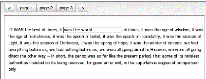
Here is the slightly abbreviated markup for the test shown above
(test_StackContainer.html):
<div id="myStackContainer" dojoType="dijit.layout.StackContainer"
style="width: 90%; border: 1px solid #9b9b9b;
height: 20em;
margin: 0.5em 0 0.5em 0; padding: 0.5em;">
<p id="page1" dojoType="dijit.layout.ContentPane" title=
"page 1">IT WAS the best of times,
....</p>
<p id="page2" dojoType="dijit.layout.ContentPane" title=
"page 2">There were a king with a large jaw
...</p>
<p id="page3" dojoType="dijit.layout.ContentPane" title=
"page 3">It was the year of Our Lord one thousand seven
hundred and seventy- five. .../p>
</div>
The StackContainer also publishes topics on certain events which can be caught
using the messaging system. The topics are:
-
[widgetId]-addChild
-
[widgetId]-removeChild
-
[widgetId]-selectChild
-
[widgetId]-containerKeyPress
Where [widgetId] is the id of this widget. So if you had a StackContainer defi
ned in the following manner:
<div id="myStackContainer" dojoType="dijit.layout.StackContainer">
...
</div>
You can use the following code to listen to events from your StackContainer:
dojo.subscribe("myStackContainer-addChild", this, function(arg)
{
var child = arg[0];
var index = arg[1];
});
Compare with the following code from the StackContainer class itself:
addChild: function(/*Widget*/ child, /*Integer?*/ insertIndex)
{
// summary: Adds a widget to the
stack
this.inherited(arguments);
if(this._started)
{
// in
case the tab titles have overflowed from one line
// to two
lines
this.layout();
dojo.publish(this.id+"-addChild", [child, insertIndex]);
// if this
is the first child, then select it
if(!this.selectedChildWidget)
{
this.selectChild(child);
}
}
},
Also declared in the class fi le for the StackContainer is the dijit.layout.
StackController. This is a sample implementation of a separate widget which
presents user controls for stepping forward, backward, and so on in the widget
stack.
What differentiates this widget from the Tabs in the TabContainer, for example,
is that the widget is completely separate and uses the message bus to listen to
events from the StackContainer. You can use it as-is, or subclass it as a base
for you own controllers.
But naturally, you can build whatever you want and connect the events to the
forward() and back() function on the StackContainer.
It's interesting to note that at the end of the fi les that defi ne
StackContainer, the _Widget base class for all widgets is extended in the
following way:
//These arguments can be specified for the children of a
//StackContainer.
//Since any widget can be specified as a StackContainer child,
//mix them into the base widget class. (This is a hack, but it's
//effective.)
dojo.extend(dijit._Widget, {
//title: String
//Title of this widget.Used by TabContainer to the name the tab, etc.
title: "",
//selected: Boolean
//Is this child currently selected?
selected: false,
//closable: Boolean
//True if user can close (destroy) this child, such as
//(for example) clicking the X on the tab.
closable: false, //true if user can close this tab pane
onClose: function(){
//summary: Callback if someone tries to close the child, child
//will be closed if func returns true
return true;
}
});
This means that all child widgets inside a StackContainer (or Tab or
AccordionContainer) can defi ne the above properties, which will be respected
and used accordingly. However, since the properties are applied to the _Widget
superclass they are of course now generic to all widgets, even those not used
inside any containers at all.
The most commonly used property is the closable property, which adds a close
icon to the widget and title, which defi nes a title for the tab.
A lot of Dijits respond to keypress events, according to WAI rules. Let's look
at the code that is responsible for managing key events in StackContainer and
all its descendants:
onkeypress: function(/*Event*/ e){
//summary:
//Handle keystrokes on the page list, for advancing to
next/previous button
//and closing the current page if the page is closable.
if(this.disabled || e.altKey ){ return; }
var forward = null;
if(e.ctrlKey || !e._djpage){
var k = dojo.keys;
switch(e.charOrCode){
case k.LEFT_ARROW:
case k.UP_ARROW:
if(!e._djpage){ forward = false; }
break;
case k.PAGE_UP:
if(e.ctrlKey){ forward = false; }
break;
case k.RIGHT_ARROW:
case k.DOWN_ARROW:
if(!e._djpage){ forward = true; }
break;
case k.PAGE_DOWN:
if(e.ctrlKey){ forward = true; }
break;
case k.DELETE:
if(this._currentChild.closable)
{
this.onCloseButtonClick(this._currentChild);
}
dojo.stopEvent(e);
break;
default:
if(e.ctrlKey){
if(e.charOrCode == k.TAB)
{
this.adjacent(!.shiftKey).onClick();
dojo.stopEvent(e);
}
else if(e.charOrCode == "w")
{
if(this._currentChild.closable)
{
this.onCloseButtonClick(this._currentChild);
}
dojo.stopEvent(e); // avoid browser tab closing.
}
}
}
// handle page navigation
if(forward !== null)
{
this.adjacent(forward).onClick();
dojo.stopEvent(e);
}
}
},
The code is a very good example on how to handle key press events in Dojo in its
own right, but for our purposes we can summarize in the following way:
-
If UP, LEFT, or SHIFT+TAB is pressed, forward is set to false, and the last
block of code will use that as an argument to the adjacent function which
returns the prior child widget if false and the next child widget if true. In
this case, the former.
-
If DOWN , RIGHT, or TAB is pressed, forward will be set to true, which will
declare the next child widget to be activated and shown.
-
If DELETE or w is pressed and the current child widget is closable, it will be
destroyed.
TabContainer
The TabContainer, which derives from StackContainer, organizes all its children
into tabs, which are shown one at a time.
As you can see in the picture below, the TabContainer can also manage
hierarchical versions of itself.
The TabContainer takes an argument property called tabPosition, which controls
where the tab icons are displayed for each tab. Possible values are "top",
"bottom", "left-h", "right-h", with "top" as default.
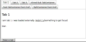
There are no special functions provided for TabContainer, which adds very little
logic to that provided from the StackContainer superclass.
AccordionContainer
T he AccorionContainer shows a horizontal bar for each added child widget, which
represents its collapsed state. The bar acts as a tab and also holds the title
defi ned for the child widget.
When the bar is clicked, an animation hides the current widget, and also
animates in the widget whose bar was clicked.
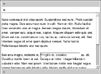
Th e abbreviated code for the test case above (test_accordionContainer.html) is
here:
<div dojoType="dijit.layout.AccordionContainer"
style="width:
400px; height: 300px; overflow: hidden">
<div
dojoType="dijit.layout.AccordionPane" title="a">
Hello World
</div>
<div
dojoType="dijit.layout.AccordionPane" title="b">
<p>
Nunc consequat nisi ...
</p>
<p>
Sed arcu magna...
</p>
</div>
<div
dojoType="dijit.layout.AccordionPane" title="c">
<p>The quick brown
fox jumps over the lazy dog. The quick
brown fox jumps over the lazy dog. The quick brown fox
jumps over the lazy dog.</p>
</div>
</div>
A funny thing about the AccordionContainer is that it requires not any old
widget as a child node, but its own AccordionPane, as you see in the code
above.
However, the AccordionPane has ContentPane as superclass, and defi nes itself
slightly differently due to the special looks of an accordion.
Also, the AccordionPane does not currently support nested Layout widgets, even
though single-level widgets are supported.
BorderContainer
Th e BorderContainer has replaced the functionality of both LayoutContainer and
SplitContainer.
Note that the outermost BorderContainer widget does not carry any layout
information. This is instead delegated to each individual widget.
As each child gets added to the BorderContainer, the layout is recalculated.
Using the BorderContainer is a very good alternative to using CSS-based
"tableless tables". For using the BorderContainer, you don't need any other
rules, and the Container recalculates positioning automatically, without the
need for additional CSS rules (except for the height/width case below) each
time you add an element or widget to the area.
Since BorderContainer widget replaces both SplitContainer and LayoutContainer,
it both lets its child widgets declare where they are in relation to each
other. Optionally, add resizing splitter between children.
Also, instead of optionally declaring one child as "client", one child must now
always be declared as "center". For some reason, the child widget now use
region, instead of layoutAlign, so a child widget which would have been defi
ned like this in LayoutContainer:
<div dojoType="dijit.layout.ContentPane" layoutAlign="top">...</div>
is now defi ned like this instead:
<div dojoType="dijit.layout.ContentPane" region="top">...</div>
All "side" widgets must defi ne a width, in style, by CSS class or otherwise,
and the same applies for top/bottom widgets, but with height. Center widgets
must not declare either height or width, since they use whatever is left over
from the other widgets.
You can also use leading and trailing instead of right and left. The only
difference is that when you change locale to a region that has text going from
right to left (like Arabic and many others), this will arrange the widgets
appropriate to the locale.
The BorderContainer also takes an optional design property, which defi nes if
the BorderContainer is a headline or sidebar. The headline is the default and
looks like the picture below. headline means that the top and bottom widgets
extend the full length of the container, whereas sidebar means the the right
and left (or leading and trailing) widgets extend top to bottom.
The sizeShare attribute for the ContentPanes used in the SplitContainer is
deprecated in BorderContainer. All ContentPanes sizes are defi ned using
regular techniques (direct stylin, classes, and so on).
From the BorderContainer test located in dijit/tests/layout/
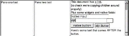
test_BorderContainer_nested.html, we fi nd the following layout:
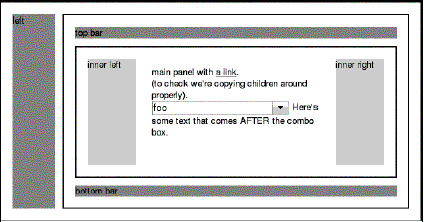
T he (abbreviated) source code for the example is here:
<div dojoType="dijit.layout.BorderContainer"
style="border: 2px solid
black; width: 90%; height: 500px;
padding: 10px;">
<div
dojoType="dijit.layout.ContentPane" region="left"
style="background-color:
#acb386; width: 100px;">
left
</div>
<div
dojoType="dijit.layout.ContentPane" region="right"
style="background-color:
#acb386; width: 100px;">
right
</div>
<div
dojoType="dijit.layout.ContentPane" region="top"
style="background-color:
#b39b86; height: 100px;">
top bar
</div>
<div
dojoType="dijit.layout.ContentPane" region="bottom"
style="background-color:
#b39b86; height: 100px;">
bottom bar
</div>
<div
dojoType="dijit.layout.ContentPane" region="center"
style="background-color: #f5ffbf; padding: 0px;">
<div
dojoType="dijit.layout.BorderContainer" design="sidebar"
style="border: 2px solid black; height: 300px;">
<div dojoType="dijit.layout.ContentPane" region="left"
style="background-color: #acb386; width: 100px;">
left
</div>
<div dojoType="dijit.layout.ContentPane" region="right"
style="background-color:
#acb386; width: 100px;">
right
</div>
<div dojoType="dijit.layout.ContentPane" region="top"
style="background-color: #b39b86; height: 100px;">
top bar
</div>
<div dojoType="dijit.layout.ContentPane" region="bottom"
style="background-color: #b39b86; height: 100px;">
bottom bar
</div>
<div dojoType="dijit.layout.ContentPane" region="center"
style="background-color: #f5ffbf; padding: 10px;">
main panel with <a href="http://www.dojotoolkit.org/">
a link</a>.<br />
(to check we're copying children around properly).
<br />
<select dojoType="dijit.form.FilteringSelect">
<option value="1">foo</option>
<option value="2">bar</option>
<option value="3">baz</option>
</select>
Here's some text that comes AFTER the combo box.
</div>
</div>
</div>
</div>
You see here the recurring theme of using ContentPanes inside Containers. Also,
the innermost "center" ContentPane wraps a new BorderContainer which has its
own internal top/left layout widgets.
Depending on what kind of application you are building, the BorderContainer
might be a good starting point. Since you already know that you can change and
reload the contents of individual ContentPanes, you are left with a layout in
which each element can function as a lightweight Iframe with none of the
negative side effects.
Also see
Lay out an application style screen, Create tabbed sections, Manage Ext widgets
within a layout, Learn advanced and nested layouts........
|
